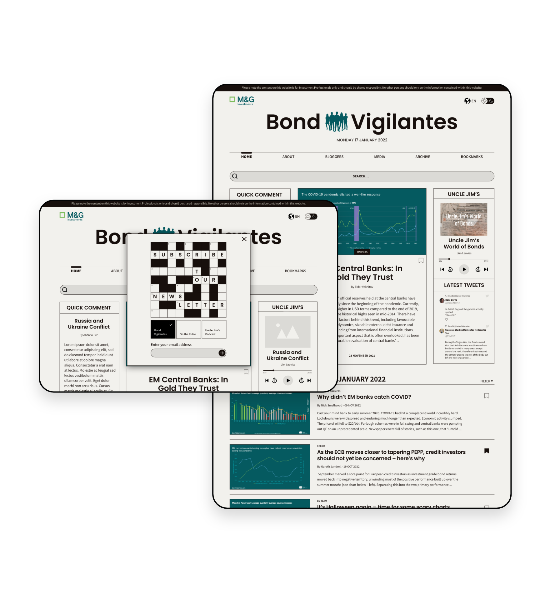
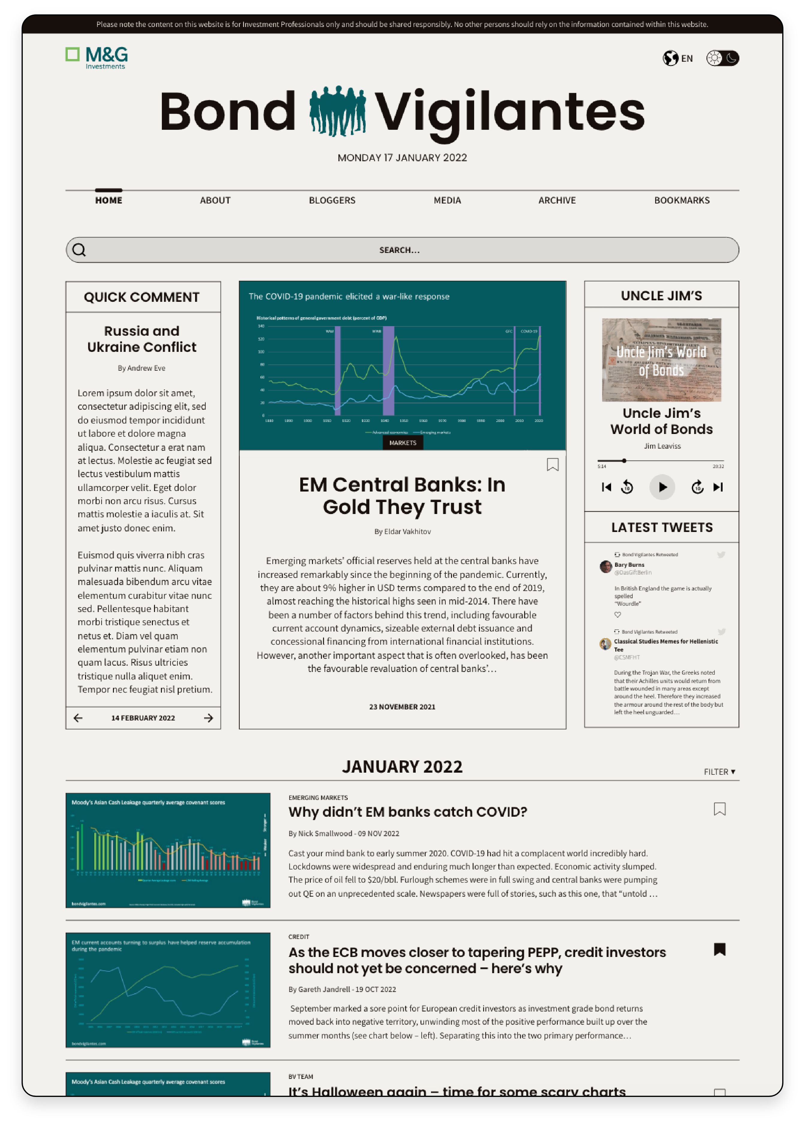
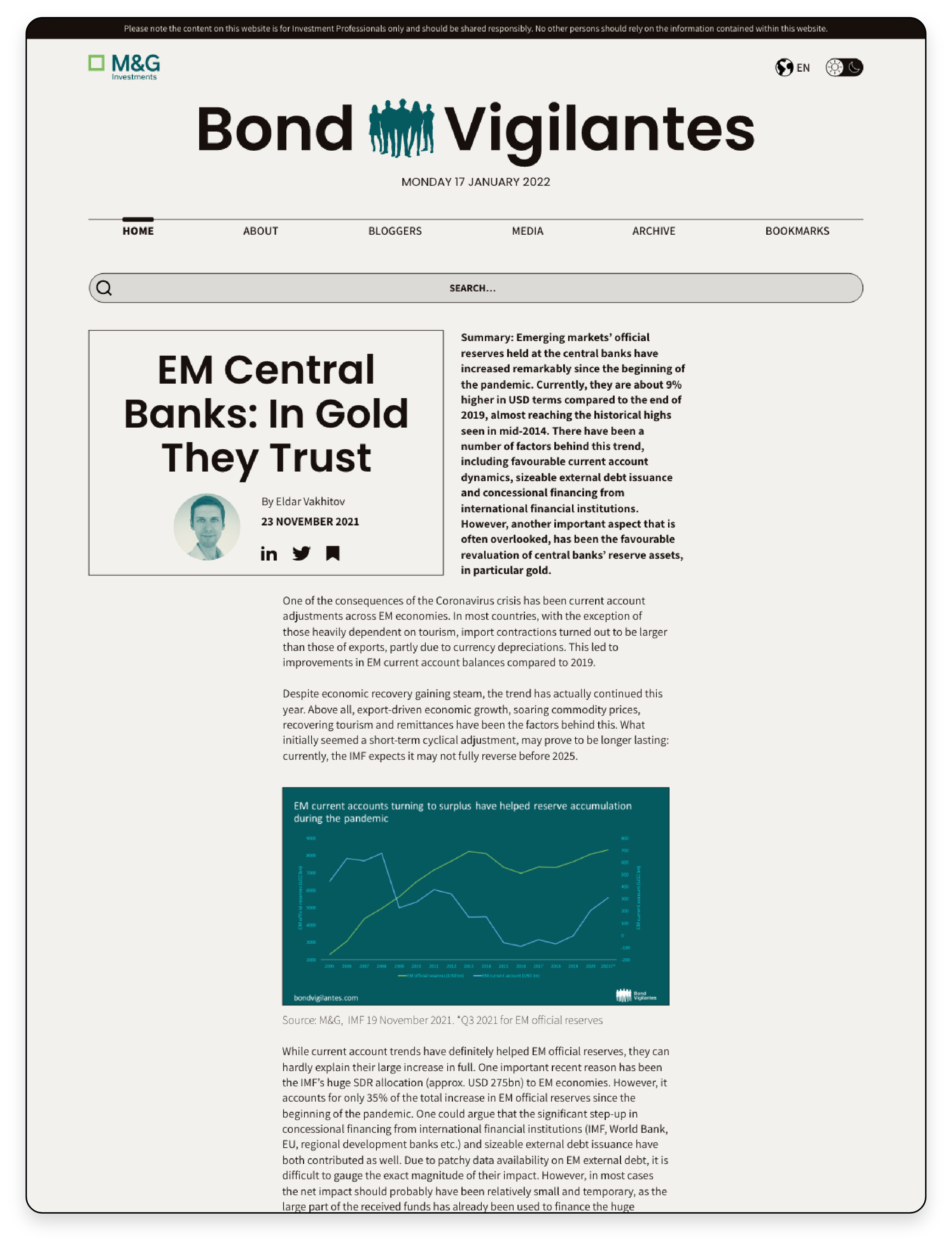
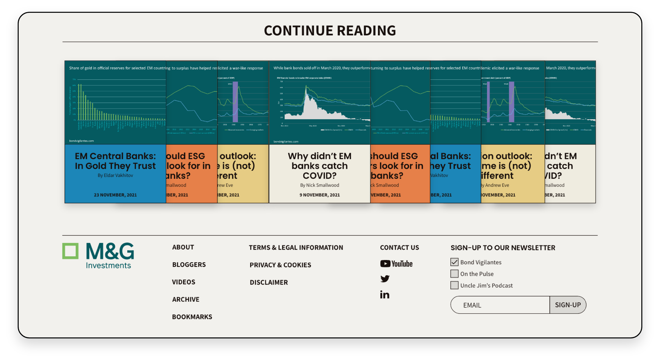
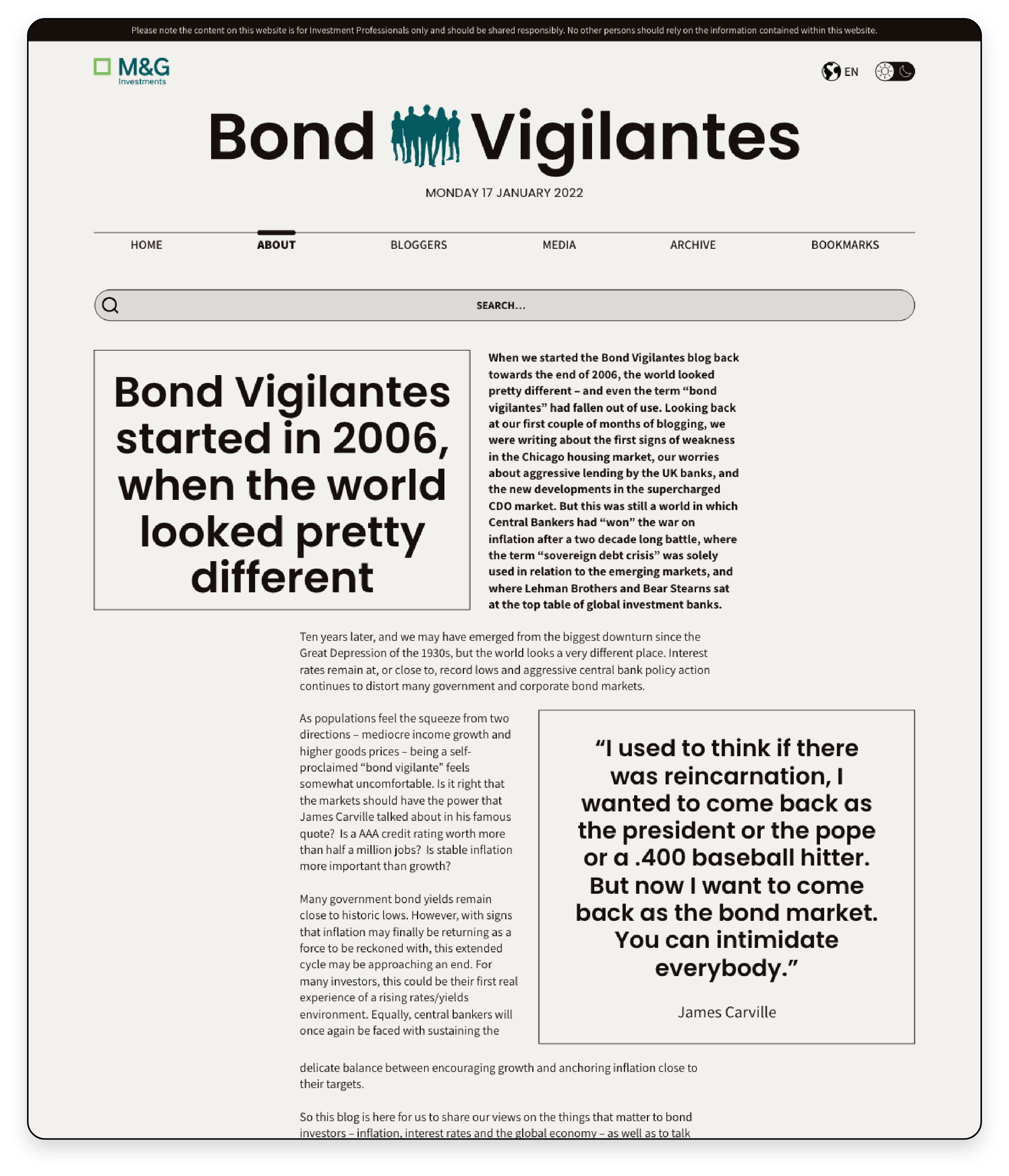
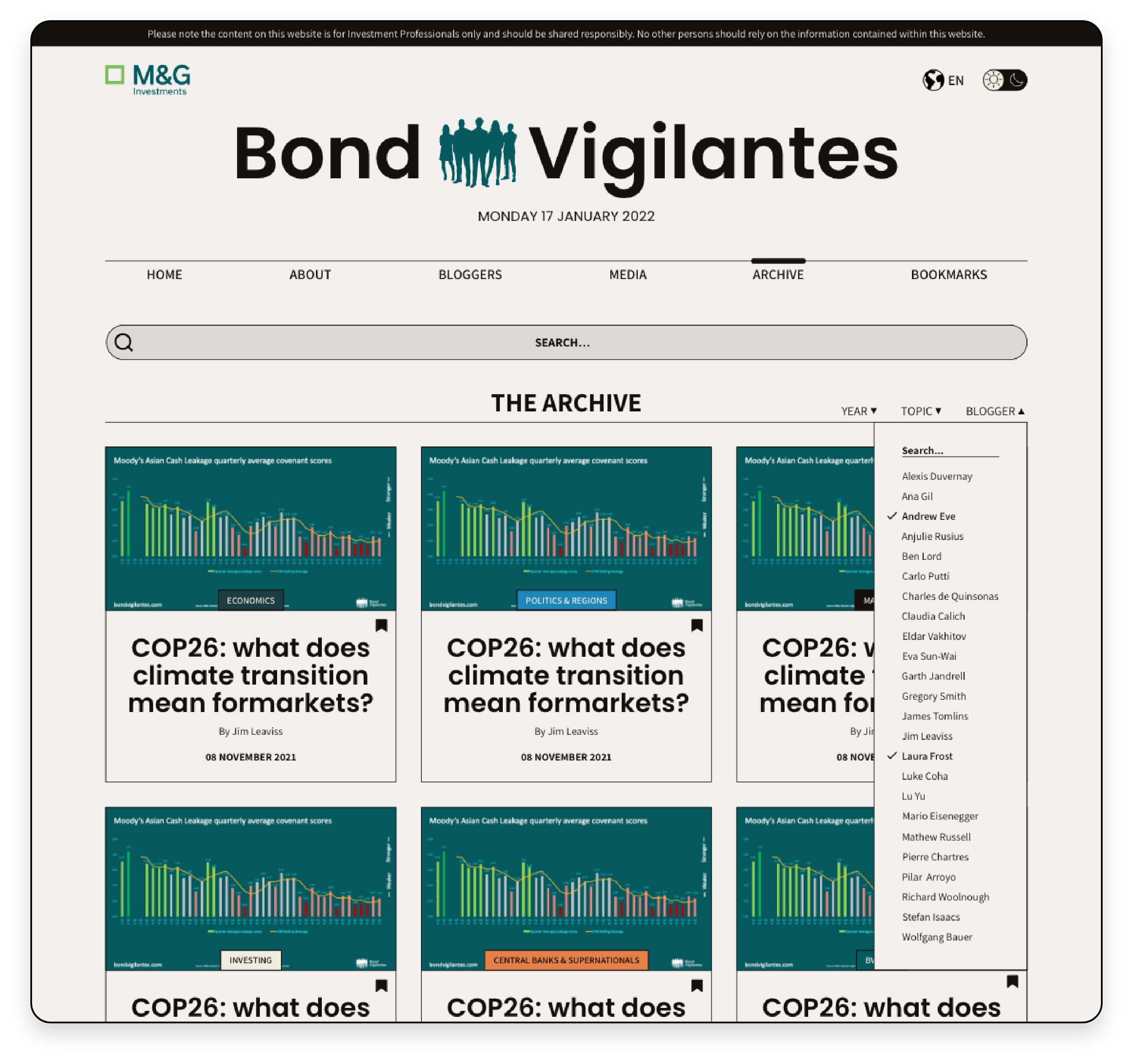
Newspapers were the main inspiration for the site design - they are familiar, trusted i.e. not Facebook,
so readers will tune into that mindset and feel that they are reading quality, well-researched content,
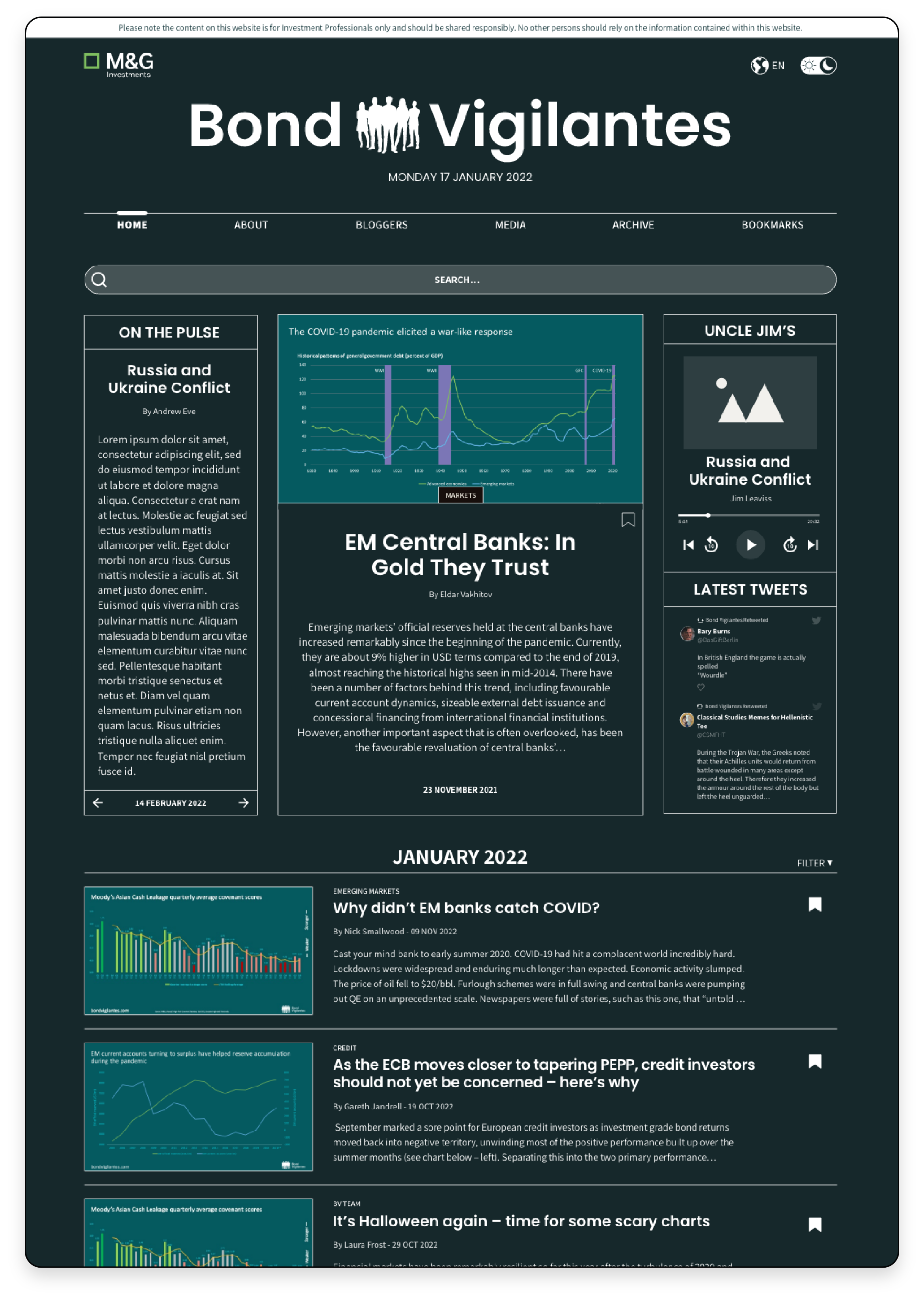
something like the FT or NY Times. There is a purposely retro/dated style to the design
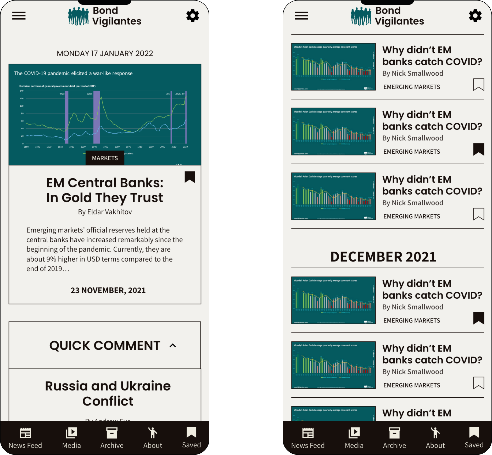
contrasted by modern functionality and typography, such as the night mode toggle and integrated media
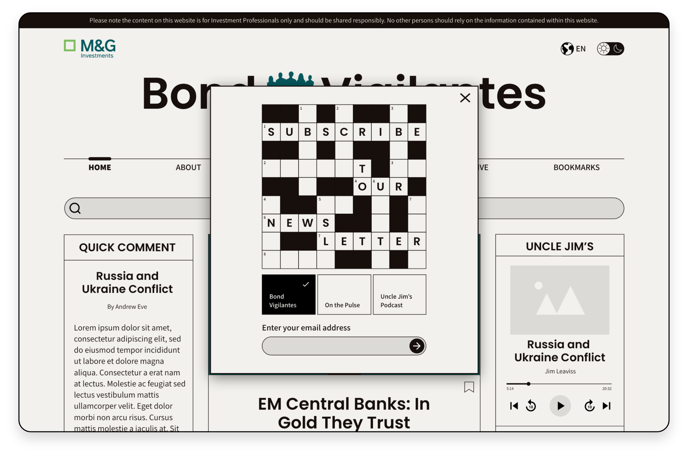
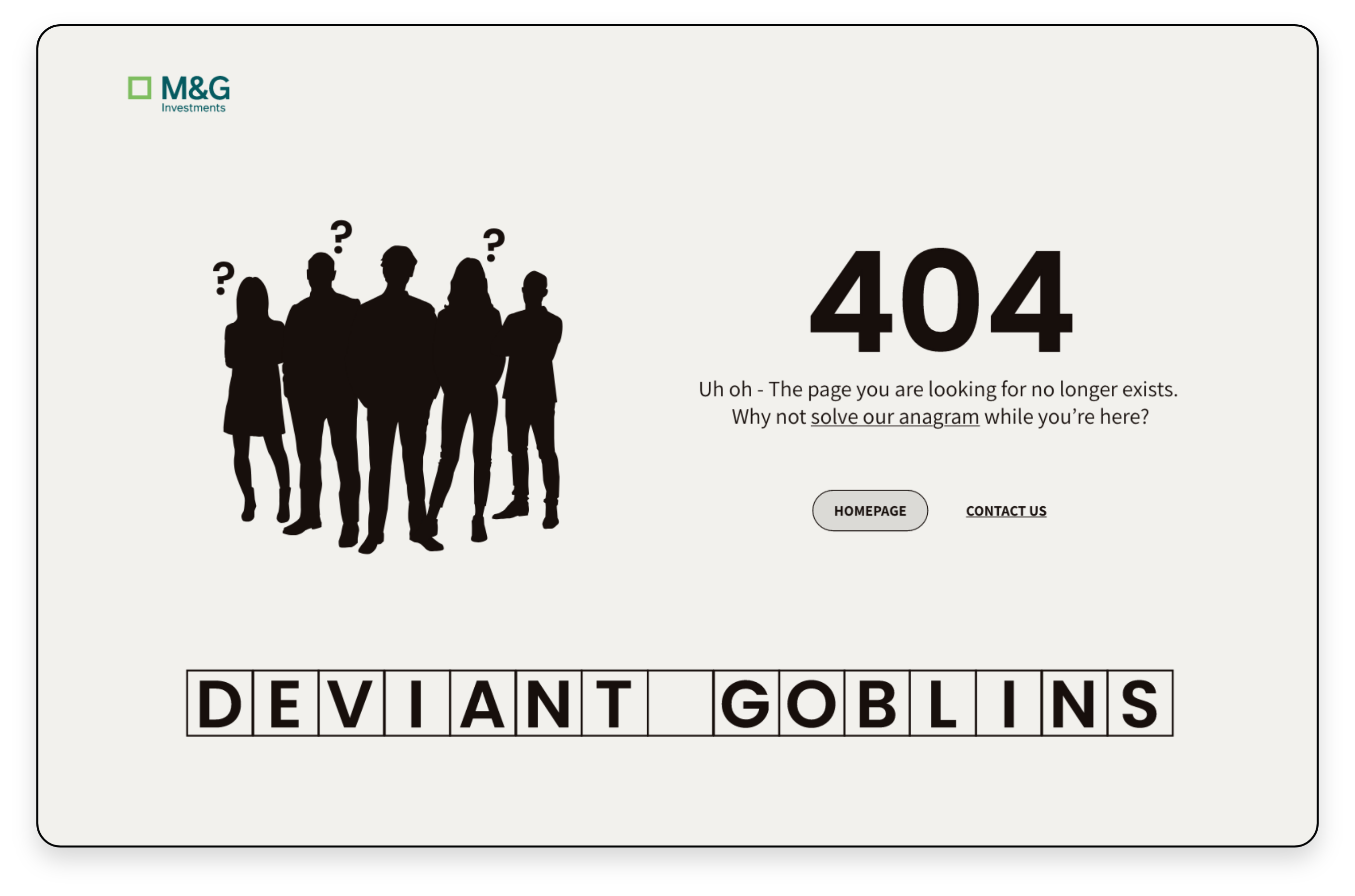
player. Keeping with the theme of print, a crossword and anagram are repurposed as the newsletter sign
up and 404 error page graphics adding a bit of playfulness to a serious sector.
